How to use design to address dyslexics
When graphic and digital designers create a website, an app, a graphic, or a corporate brand image, legibility / readability is one of the main elements we need to pay attention to. This raises a question of whether designers are sufficiently aware of the importance of legibility / readability also for individuals with impaired ability to read and comprehend information, such as people with dyslexia.
Dyslexia is a specific learning problem characterized by reading, writing and spelling problems. The combination of these problems leads to a reduced scope of vocabulary acquired, as well as poorer processing and memorization of information. A relatively high share of population is facing dyslexia – as many as 7% of the world population, including 200,000 Slovenians. Even so, designers often pay too little attention for our products to be appropriate and understandable to them. In order to make it easier for them to read the website, app or graphics and thus improve their digital experience, we need to pay attention to many elements, presented below.
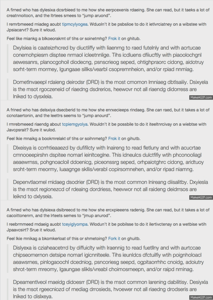
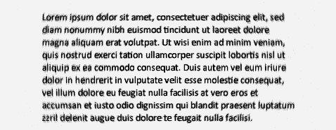
The picture shows an example of how people with dyslexia perceive a website.
- SCRIPT FONT
- The script font should be clear and non-serif (non-serif letters have no terminals at horizontal and vertical strokes) (sans serif font).Examples: Arial / Helvetica, Comic Sans, Century Gothic, Verdana, Calibri.
- Only one font type should be used throughout the website.

- DYSLEXIC SCRIPT FONT
- There are at least four script fonts adapted for people with dyslexia (e.g. Open Dyslexic, Read Regular, Dyslexie, Lexia Readable).
- Research shows that dyslexics read dyslexic fonts much faster and make far fewer mistakes while reading.
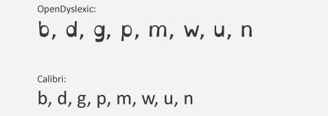
- Advantages of dyslexic fonts: larger line spacing, greater ascender and descender (up and down letter extension), greater differentiation between letters (especially the letters b, d, g, p, m, w, u, n).
- SCRIPT FONT SIZE
- Use a font size of 12pt for longer texts.
- Certain websites allow the user to use CTRL and +/- to adjust the font size (or adjust a size for all web sites in browser settings).
- The font and spacing should be larger: if the letters are too »cluttered« or too similar, the person may misidentify them, making it difficult to read.
![]()
- LINE LENGTH
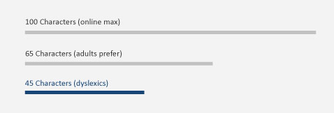
- For dyslexics, the maximum line length is 45 characters. For adults with no reading difficulties, the line length is between 65 and 75 characters.
- Text columns should not be too close together (as in most newspapers).
- LEADING
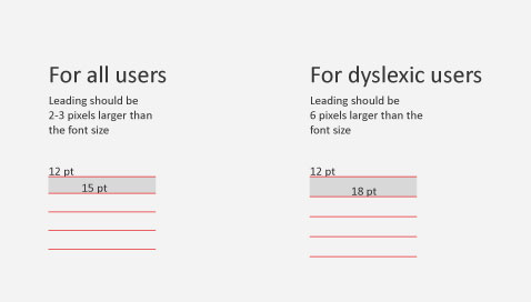
- In case of 12pt font size, leading should be 18pt (1.5 leading).
- For normal users, however, leading is 2-3 pixels larger than the font size (15px leading at 12pt font size). For dyslexics, the leading should be 6 pixels larger than the font size.
- TEXT JUSTIFICATION
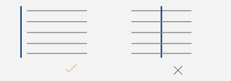
- Text should be aligned along the left margin and not centre-aligned.
- PARAGRAPH COMPLEXITY
- Keep sentences and paragraphs as short as possible.
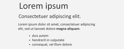
- The text should be separated by subheadings that are 20% larger than the rest of the text. This makes it easier to go through the text quickly and extract the main article content.
- Use paragraph numbering (with numbers) or the indents when listing facts or dividing text.
- There should not be too many links to other sites as they disrupt concentration.
- The vocabulary should not be complex but clear and simple.
- SCRIPT FONT AND BACKGROUND COLOUR
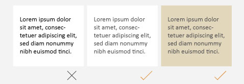
- A smaller contrast between the colour of the text and the background is recommended.
- When the background is white, the font colour should be dark grey rather than black. The contrast between white and black can create a blurred effect.
- A softer white or cream colour is more suitable background colour (e.g. R226 G215 B188).
- Red, green and pink should be avoided, as these colours are often more difficult to distinguish / see / detect by the dyslectics.
- TEXT
- Avoiding italic and underlinedfont styles is recommended – rather use bold.
- Don’t write in ALL CAPITALS.

- GRAPHICS, ANIMATIONS AND SOUND EFFECTS
- Animation, moving backgrounds and noisy sounds should be avoided. These are very distracting elements.
- Clear and simple graphics should be used.
Designing according to these guidelines is more enjoyable and readable even for people who experience no difficulties in reading comprehension. Following these rules makes the text more transparent and more “breathable”. The structure of the text with larger headings, bold words, and larger sentence spacing can help people who don’t have time to read the entire text, allowing them to simply go through it and quickly get the point. The designer must thus follow the guidelines explained in order for his / her product to influence a wider audience and to facilitate the experience for those with reading difficulties.
Maybe the question here is whether strict adherence to the guidelines can hinder a designer’s creativity. Therefore, finding a balance between aesthetics and utility is crucial. Something may be aesthetically perfect, but must also satisfy its purpose.
Share this article
Articles by the same author
Authors
Archives
- May 2023
- November 2022
- September 2021
- April 2021
- March 2021
- July 2020
- June 2020
- May 2020
- April 2020
- March 2020
- January 2020
- December 2019
- November 2019
- October 2019
- September 2019
- August 2019
- July 2019
- June 2019
- April 2019
- March 2019
- February 2019
- January 2019
- December 2018
- November 2018
- July 2018
- May 2018
- April 2018
- March 2018
- February 2018
- February 2017
- December 2016
- July 2016
- May 2016
- February 2016


