The Basic Principles of Graphic Design
Communicators are aware of the importance of graphic design. If we want to convey a message or idea successfully, it is essential that we support them with visually. How text and visuals are intertwined is evident in everyday things, the ones taken for granted, for example, social media posts, posters, billboards, presentations, logos, or websites.
Every graphic designer should be familiar with the basic principles of interaction and combination of graphic elements. The following text describes the most important principles of graphic design with detailed descriptions of contrast, balance, emphasis, repetition and element proportion, hierarchy, and white space.
Pay attention to contrast
Contrast is one of the most important principles of graphic design, because it helps distinguish elements and draw viewer’s attention. For better visibility and readability, the text colour on a dark background should be light to distinguish the elements from one another. See the use of contrast in the two examples below, the left one showing good contrast (dark background, light prominent text) as opposed to bad contrast in the right illustration (dark background, brown illegible text).

The importance of balance
Every element we want to design has its weight. Balance as a graphic design principle refers to element placement which allows graphic design stability. The left example below shows a perfectly balanced composition with symmetrical elements. The right example shows discordant composition: the elements are too close together which puts too much weight to the left side of the composition.

There are two types of balance, symmetrical and asymmetrical. With the former, the weight of the elements is evenly distributed; with the latter, it is quite the opposite: the heavier element is levelled with the easier one which creates contrast.
Emphasize the elements according to their importance
Emphasis relates to the importance of elements and the order of their placement. The principle of emphasis is to draw viewers’ attention to the most important information; that is, the information we want them to see first. For example, the first thing we want to see in a film poster is the title, followed by the names of the director and cast. Below, the title in the left illustration is well emphasised (first you see the title, followed by the subheading, and finally the background elements), whereas in the right illustration the title is badly emphasised (the emphasis is on the orange element in the background, only then you see the subheading and finally the title).

Repeat the elements to achieve company recognition
Repetition is a great principle if we want to unify an idea throughout the graphic composition. Repeating the colours, fonts, and shapes leads to company recognition. The latter is visible below: the elements in the left example are repeated well (two different but corresponding colours, aligned circles). However, that is not the case in the right example (different, unrelated colours, scattered elements, a square unrelated to circles).

Emphasise the elements with the correct proportions

Don’t forget about visual hierarchy
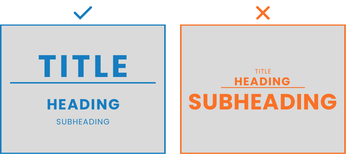
The principle of visual hierarchy says that the most important elements should also be emphasised the most, which determines the importance of elements. See examples of good and bad hierarchy respectively in the following illustrations. In the left illustration, the titles are distributed according to importance, the main title being the biggest. The main title in the right illustration does not stand out and is thus, invisible.

Create some “breathing space”
Empty or negative space refers to the empty part of a composition where there are no graphic elements. Empty space is important because it allows “breathing space” to help distinguish the elements. The two examples below show good and bad use of empty space respectively. In the left illustration the circle is placed in the middle with enough empty space, whereas the circle in the right illustration leaves almost no empty space.

Our senses are exposed to stimuli which need to be recognised and responded to all the time. Due to an enormous amount of data, our brain is capable of processing only the most important information. Therefore, to attract the viewers’ attention, graphic designers must apply these basic principles to their graphic design. Not only will their final product look better but it will also motivate viewers to act, for example, purchase an item or become interested in an item or a brand.
Share this article
Articles by the same author
There are no articles by the same author
Authors
Archives
- May 2023
- November 2022
- September 2021
- April 2021
- March 2021
- July 2020
- June 2020
- May 2020
- April 2020
- March 2020
- January 2020
- December 2019
- November 2019
- October 2019
- September 2019
- August 2019
- July 2019
- June 2019
- April 2019
- March 2019
- February 2019
- January 2019
- December 2018
- November 2018
- July 2018
- May 2018
- April 2018
- March 2018
- February 2018
- February 2017
- December 2016
- July 2016
- May 2016
- February 2016
