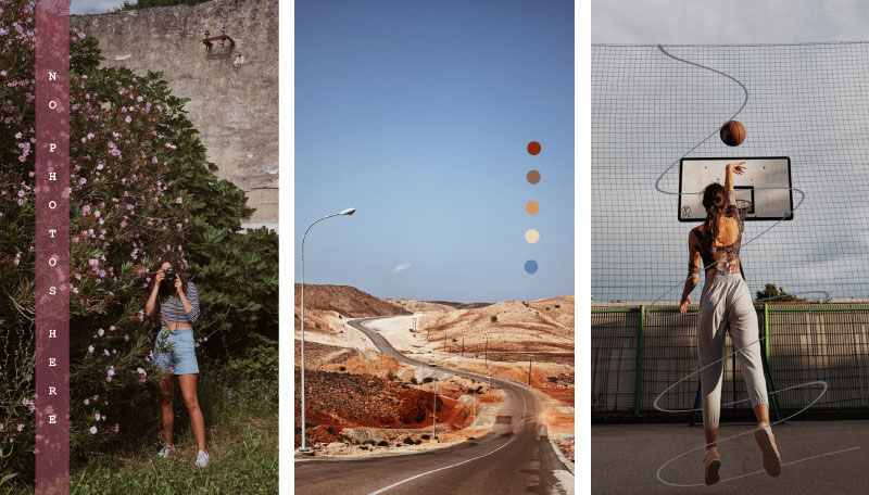
The power of colours — part 1
Colours evoke different feelings and affect our emotions and behaviour. Colours brighten our day and help us to receive and send messages in a quality and memorable way. Colours influence our daily decisions, including purchasing. The choice of colour can thus be the difference between mediocrity and standout.
Have you ever wondered why a certain colour is your favourite? Which colours we prefer and which we don’t like can also be influenced by their meaning. Each colour carries, so to speak, its own personality, which each individual may perceive differently. It is not necessary to associate blue with the sky or the sea. The same colour can, therefore, have different meanings, which are influenced by many social and environmental factors.
It is already clear from the above that colours also have a significant impact on the perception of brands. Colour psychology can be used to help create a strong and memorable brand. By using appropriate colours, we can influence consumer behaviour, the transmission of key messages and their perception. Colours increase brand recognition by 80 percent, 62–90 percent of product evaluation was supposed to be based only on colours and, at the same time, colour influences the purchasing decision in 85 percent of cases. Understanding the psychology of colours is, therefore, extremely important for the success of a brand, its positioning and perception.
When it comes to branding, the power of colour is perceived on an emotional and practical level. On an emotional level, colour can affect how consumers feel when they look at a brand and, on a practical level, colour helps a brand stand out from the crowd. To make it easier to decide which colour to use in a particular situation, let’s look at what each colour typically communicates and represents.
In the first part of the blog, we will focus on warm colours. These include red, orange, yellow and other variants, such as pink, among others. These colours excite heat because of their brightness and connection to the sun. They generally express optimism, enthusiasm and passion.

Red
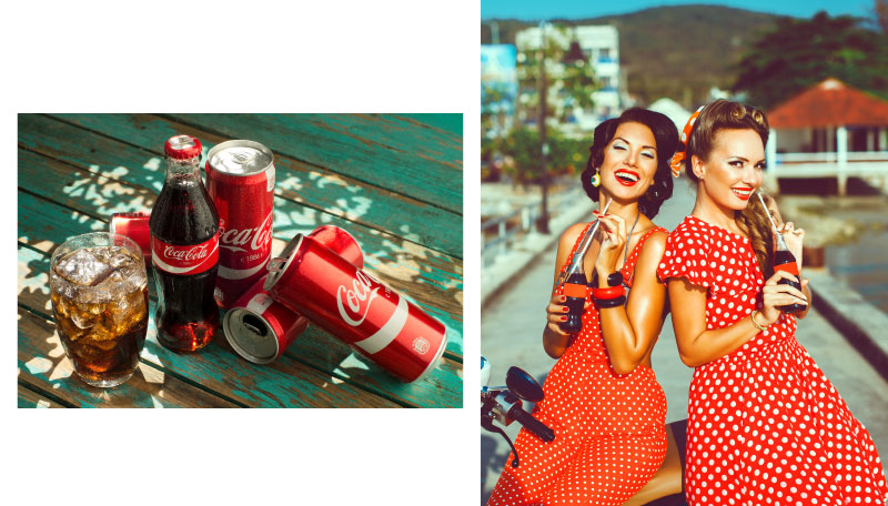
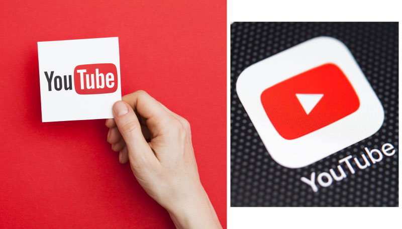
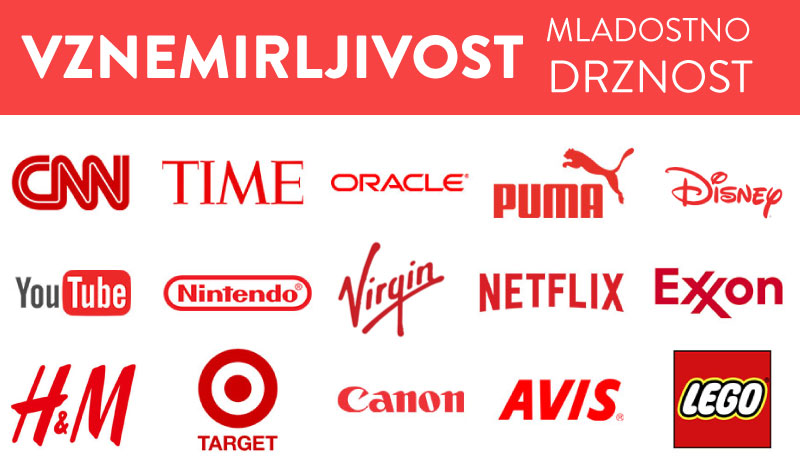
In colour psychology, red is the most intense and can evoke the strongest emotions. It is a bold, energetic and vibrant colour that symbolises strength, confidence and influence. We also associate it with enthusiasm, passion, danger, energy and action. You may have already noticed that some brands use red for buttons that call for an action (e.g. ‘order now’) or for packaging to make products stand out on the shelves. But beware, red can also pose a danger, so the colour should be used sparingly.
Red is an iconic colour used for brands like Coca Cola and YouTube. It stimulates the appetite, which is why brands such as Coca Cola often use it in their products. The red part of the YouTube logo is a play button that can convince someone to take action. It helps to subconsciously press the play button.
Orange:
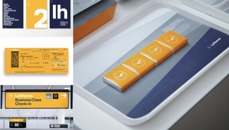
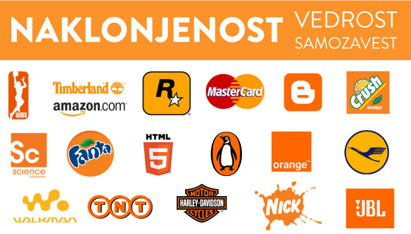
It represents creativity, adventure, enthusiasm, success, activity and balance. It is even supposed to stimulate the appetite. The orange colour adds spice to any image and site. At the same time, it has different tones and shades, each with a different meaning and effect. For example, light pastel tones are considered sweet and light, while more intense and vibrant shades of orange represent vitality, courage and energy.
Because orange is associated with fun, it is suitable for youthful, energetic and vibrant brands. Luxury, traditional or more corporate-oriented brands should avoid the colour orange.

Yellow:
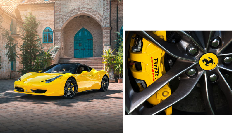
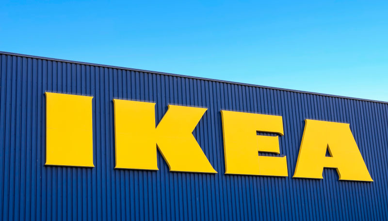
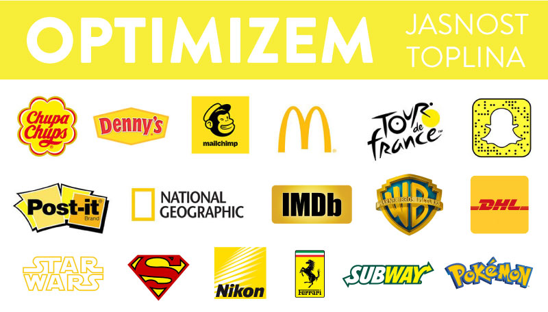
In colour psychology, the meaning of yellow revolves around the sun. It evokes feelings of happiness, positivity, optimism, kindness, serenity, and summer, but also deception and warnings. It is the most visible colour from afar (so it is used on some traffic signs). For example, a small touch of yellow can help website visitors associate a brand with something positive. At the same time, yellow is also a precautionary colour, used in life jackets, police tape and in dangerous areas.
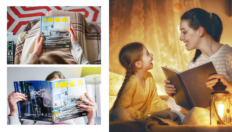
Yellow is found in the Ferrari and Ikea brands, for example. Many people dream of driving a Ferrari. The luxury brand is associated with a sense of happiness, summer and a carefree lifestyle. But how is the purchase of furniture related to happiness? Let’s see who is most likely buying these products. Mostly these are people who have just bought their first home or are moving out for the first time, so something new is happening in their lives. They will go to Ikea for products to furnish their home. This milestone is usually filled with happiness and optimism, making yellow a great colour to associate with a brand.
Pink:
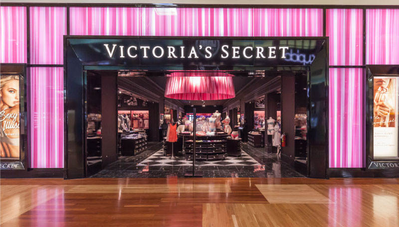
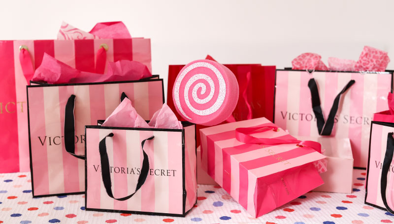
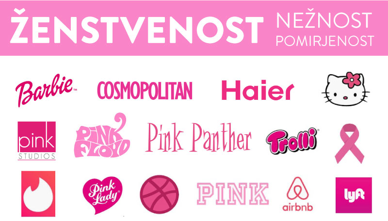
Pink is a popular colour of brands targeting a female audience. In colour psychology, the meaning of pink revolves around femininity, playfulness, and unconditional love.
Since the meaning of pink includes femininity, it is no surprise that brands like Victoria’s Secret and Barbie use this colour so distinctly.
Like all colours, pink is quite diverse, as the degree of intensity can affect its meaning. Pale pink is often meant for young girls, powder pink is more sentimental or romantic, and strong pink indicates youth.
If we analyse the message of well-known brands and the colours they use, we can see that colour plays a big role in this. Here are a few more examples.
Viri: https://review42.com/resources/color-psychology-facts/
https://www.emerald.com/insight/content/doi/10.1108/00251740610673332/full/html
Share this article
Articles by the same author
Authors
Archives
- May 2023
- November 2022
- September 2021
- April 2021
- March 2021
- July 2020
- June 2020
- May 2020
- April 2020
- March 2020
- January 2020
- December 2019
- November 2019
- October 2019
- September 2019
- August 2019
- July 2019
- June 2019
- April 2019
- March 2019
- February 2019
- January 2019
- December 2018
- November 2018
- July 2018
- May 2018
- April 2018
- March 2018
- February 2018
- February 2017
- December 2016
- July 2016
- May 2016
- February 2016

