The power of colours — part 2
In the first part of the blog, we talked about the importance of colours in creating a brand image and the message we want to convey.
We have presented the meaning of warm colours in more detail, so now let’s look at the meaning of cool and neutral colours. Cool colours include green, blue, and various variations, such as purple, known for their calming and relaxing effect. The neutral palette, on the other hand, features brown, white, black, and variants, such as grey. They can also be called earth tones. They are sophisticated and, among other things, they can have a mighty, perfect, and pure effect.

Green:
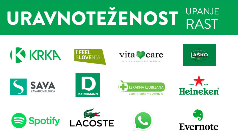
The colour green symbolises nature, growth, calmness, balance, confidence, health, serenity, strength and fertility. It is used in environmental awareness, organic products, and vegetarian and vegan products. Because its effect is very relaxing, it is often used in stores to relax customers.
When choosing a shade of green, it is important to keep in mind that a lighter shade will be associated with growth, vitality and renewal, while a darker shade will indicate prestige, wealth and abundance.
The Starbucks brand successfully uses the meaning of green. In their ‘green’ cafés, they promote a feeling of relaxation and invite customers to take time to relax and take a break from a stressful day.


Blue:
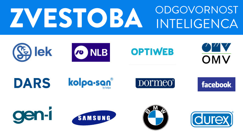
In colour psychology, blue is closely related to the sea and the sky. Stability, security, harmony, peace and trust are just some of the feelings that a customer associates with your brand when you are visually communicating with blue. Some merchants have icons in blue for warranty or free shipping to enhance the trust aspect.
Blue is mostly used by technology, financial and pharmaceutical companies, as well as banks and government organisations, as blue represents authority, loyalty, power and professionalism. However, brands from the world of pharmacy, cosmetics and personal care (e.g. Oral B, Pfizer, etc.) usually use blue to emphasise the quality, reliability and safety of their products.


Purple:
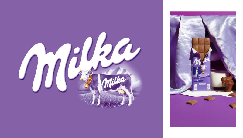
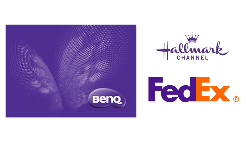
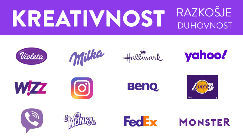
Purple is considered the royal colour. It is associated with courage, creativity, strength, nobility, luxury, majesty, wisdom and spirituality.
Because it signifies mystery, reality, sensuality, power, luxury and even sentimentality, it can be used in its entirety or only as a colour of emphasis. Darker shades often represent luxury, while lighter shades are more feminine, sentimental and nostalgic.
Brown:
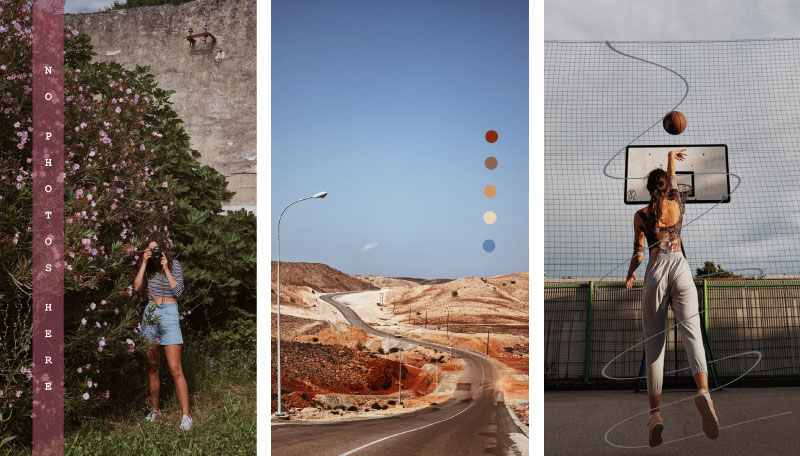
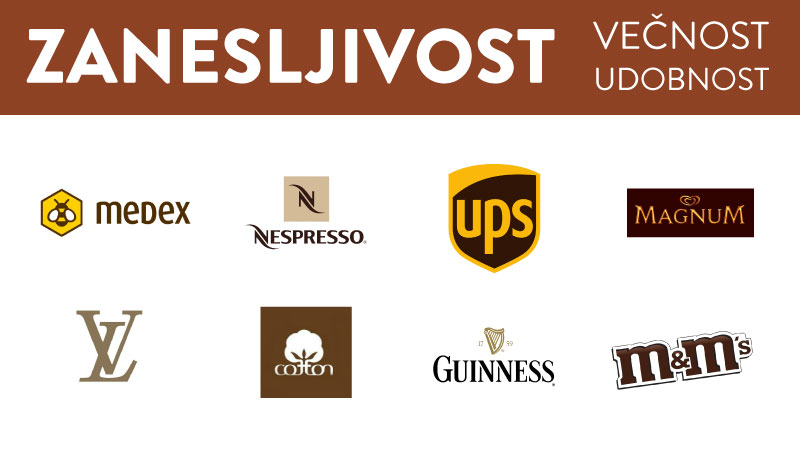
Brown creates a bold, earthy and traditional look or mood. It refers to comfort, reliability, safety, honesty, quality and being down to earth. Nowadays, brown colour is often used for organic and natural products in the field of food and cosmetics. It represents a feeling of fullness, order and justification. As always, however, we need to be careful and use brown with caution, as it can also resemble dirt.
As things get older, they usually take on a brown patina. In this sense, brown shows us that an object is long-lasting and durable. This makes brown a good choice for vintage-style logos — it gives the impression that the company has been around for a long time.
UPS is an example of a brand that makes great use of colour meanings. Yellow can represent the joy of receiving a package, and brown reliability and security. Thus, together they create the meaning of a safe and reliable company, which is exactly what we want from the delivery service.

White:
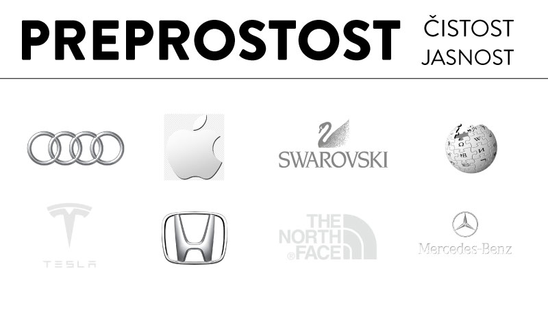
White represents simplicity, purity, innocence, clarity, optimism, idealism, health and perfection. This is why it is a popular colour choice for technological and medical products.
It can happen that, when used excessively, white creates a feeling of coldness, sterility and emptiness. Therefore, it is important to add another colour when choosing a white logo, taking into account the colour meaning and message of the latter.
An example of a brand that has taken advantage of white is Apple. Namely, white represents the simplicity of their products both in terms of design and functionality.

Black:
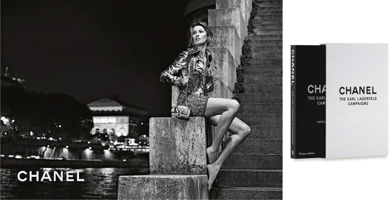
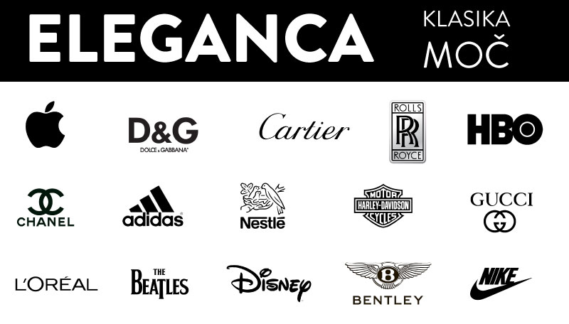
In colour psychology, black is a symbol of mystery, power, luxury, exclusivity, elegance and sophistication. Black is a bold, classic and sophisticated colour.
In addition to the mentioned qualities, black can also be associated with aggression, conservatism, strength and success.
We often find black in the fashion world, as it represents top luxury brands. In packaging, the black colour creates a strong and impressive effect, and the products get an elegant and luxurious touch.
Brands that use logos in black are usually well-established and deeply rooted. They have no need for attention. They know that their reputation speaks for itself and they do not need colours that would further express their strength, stability and value.
A few more examples of brands and their connection to the meaning of colour.
Share this article
Articles by the same author
Authors
Archives
- May 2023
- November 2022
- September 2021
- April 2021
- March 2021
- July 2020
- June 2020
- May 2020
- April 2020
- March 2020
- January 2020
- December 2019
- November 2019
- October 2019
- September 2019
- August 2019
- July 2019
- June 2019
- April 2019
- March 2019
- February 2019
- January 2019
- December 2018
- November 2018
- July 2018
- May 2018
- April 2018
- March 2018
- February 2018
- February 2017
- December 2016
- July 2016
- May 2016
- February 2016


