
What is it that attracts the eye in a deluge of visual information? Can graphic elements influence the purchase of a particular product? A good design must arouse interest in us, create a certain atmosphere and leave an unforgettable impression. Marketing studies indicate that average American is exposed to approximately 5,000 ads and brands every day. In this deluge of information, only 12 of them have a serious impact. That is why designers must regularly follow the trends, consider and upgrade them in our creativity in order to make our product stand out in the abundance of information.
Whether it’s a new logo or the refreshment of the existing one, a creation or refreshment of the package, or a website re-design, it’s good to be familiar with the key trends that mark the current world of design. Taking modern design guidelines into account can significantly contribute to the brand reputation, influence the advertising results and increase the final sales.
Let me present three trends that have already leave a mark and will have some more impact in 2019.
“The blackness and a dark / bright colour scheme”
Nowadays, the dark mode is becoming more and more popular – whether on screens, in various apps or design in general. The blackness is combined with textures or the shiny and matte effects are mixed. It represents luxury in the world of product design, raising the product to a premium level. Another combination with the black create more radical graphics (“punk”, “biker”) or arouse mystical feelings.
Most advanced technology companies offer a dark and bright mode in their designs and apps in recent years. Facebook recently added a dark mode to its Messenger app. Apple has been following this trend for some time now by including the dark screen mode in its apps and operating system. The smart Apple Watch is the latest example of this company’s products updated in this spirit.
“Vivid colours”
Colour is a very important part of a brand and a product. It has a deep and often subconscious effect on our behaviour and unconsciously influences our purchasing decisions. According to the CCI (Institute for Colour Research) study on the colour and its influence on sale, 92.6% of people find the colour the most important factor in making a decision regarding a product purchase.
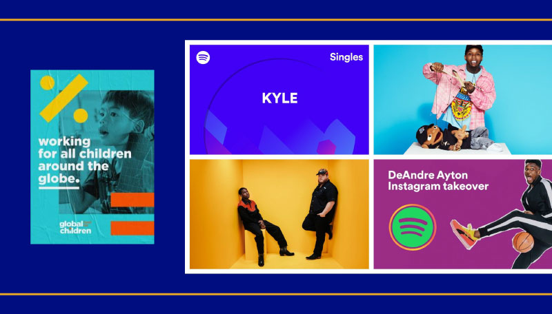
Right now, the most popular are vivid, striking and noticeable colour combinations that spread a slight 80s and 90s nostalgia. Businesses and brands are making sovereign choices for ever more vivid colour creatives and campaigns that immediately attract the viewer’s attention. This trend continues the colour palette of the 80s, adding some new colour combinations for modern consumers in the digital age. All the pastel shades have been transformed into their vibrant colour colleagues.
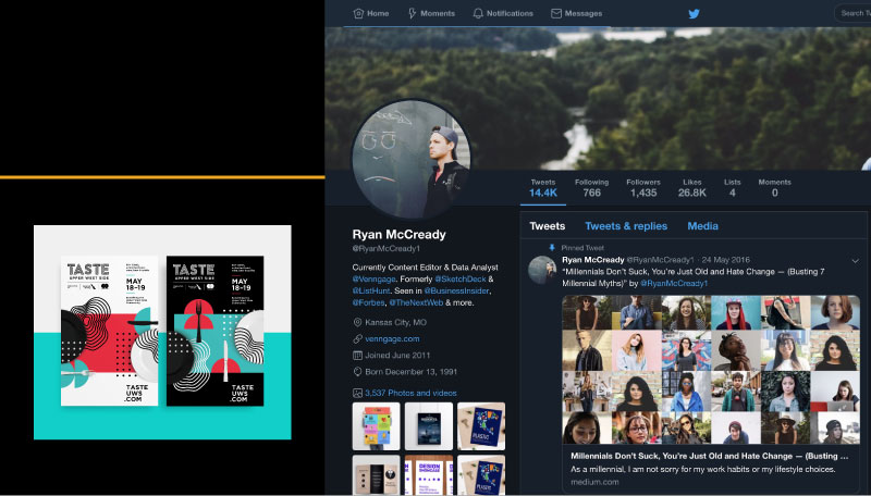
“Strong, bold typography”
Typography is an essential part of graphic creativity. It is therefore not surprising that designers boldly try out new solutions every year, completely transforming the existing typography. Recently, the use of a bold font has significantly increased and is often a primary element of printed or web creativeness. Also the use 3D effects, unusual spacing and bright tones is popular, further emphasizing the bold typography. The latter appears in the centre and the first phase of graphic elements, leaving a strong impression and individuality, and projecting power.

The advertisers and marketers are struggling to stand out in the market, therefore the use of recognizable typography can represent an effective strategy for a more powerful influence on their consumers. Following the trends is consequently important for both entrepreneurs and trademark owners. They have to keep up with the times, adapt to the market happenings and change their image depending on what catches their customer’s attention. Plus, they must always keep their brand up-to-date.
The trends also represent inspiration, keep the way of thinking contemporary and offer a launching pad for a conceptual design of a creative. In any case, it is desirable to be creating in our own style with the help of trends and not to use direct copying. Only then can we differ from others in the market. There is nothing wrong with not applying the trends, but it is nevertheless important to know and follow them.